-

- Products
- Interior Paints
- Colour Collection 2021
Product Description
At Jotun, we have been creating colours for nearly 60 years. Our library spans thousands of hues, each one with a story to tell. In the past, our annual colour card has showcased our newly created tones and shades for the home. This year, however, we REDISCOVER.
Some of the colours in these pages are new, but many have been carefully picked from our archives – timelessly inspiring hues that can be called on to tell new stories in our homes. We have grouped these colours into four families – four stories, if you like – but this is not intended to be prescriptive. Our home, like our life, is what we make it. And no matter the colours we choose, the truly considered home never goes out of style.
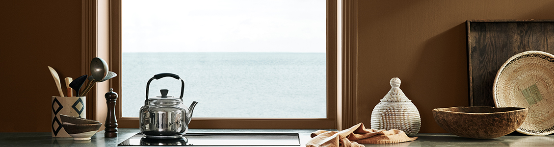
Earthy Shades
Clay and stone, sand and soil. These are the raw materials from which our houses and cities are made, the essential building blocks of human life.
This is a palette for creative travellers and connoisseurs of craft, drawing influences from cultures across the globe to create 21st-century interiors that relax and inspire.
Whether creating a small, cosy area to relax and daydream or decorating entire spaces, these hues transport us to simple times and rural settings, evoking heritage and history, rich cultural traditions and the crafts of the hand.
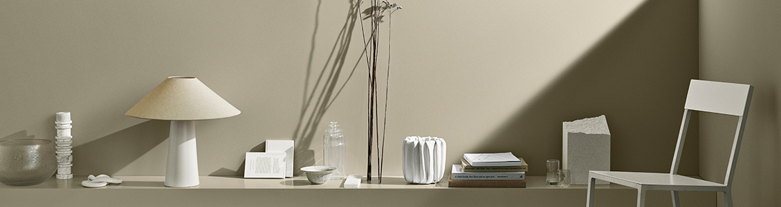
Soft Neutrals
In a world of noise and clutter, we are drawn to clarity and peace. We find them by dialing down the volume of our homes, removing the superfluous and celebrating the simple. Chosen well, subtler, quieter colours can have a powerful impact. These shades might not be bold; they might not scream for attention, but they bring comfort and clarity in their softness and subtlety.
Minimalist spaces don’t have to feel cold or empty; this rarefied palette is a selection of timeless warm shades that can be used to create monochrome looks or combined to introduce subtle and engaging contrasts to your space.
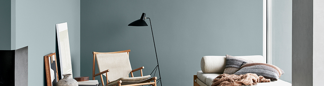
Nordic Blues
While the earth grounds us, the sky and the sea lift us up. They open our minds to the infinite and the unknown, encouraging us to find tranquility in a remote wilderness or a distant horizon. The grey-blue of the ocean, white wisps of cloud, mountain stone… These are the colours of wild and far-flung places – the kind we retreat to when we want to immerse ourselves in nature. In a world of noise and distraction, botanical shades and stone greys cultivate a sense of simplicity. These shades make spaces into sanctuaries, encouraging slower-paced and more mindful ways of being, and making the home a place of reflection and rest.
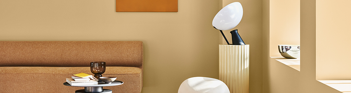
Nostalgic Pastels
This is a palette for aesthetes and connoisseurs – those who appreciate design heritage and art history. The colours are both retro and forward-looking, bringing vintage touches to contemporary interiors and evoking the mid-century style of the Nordic regions.
Use these colours to adorn inspirational and uplifting spaces where new ideas can be born, daydreams can be indulged, and fancies can take flight.
Belgian Brown
10385
Belgian Brown10385
Cityscape
6379
Cityscape6379
Coastal Blue
5504
Coastal Blue5504
Crisp
8118
Crisp8118
Earthy Brown
12127
Earthy Brown12127
Golden Bronze
10963
Golden Bronze10963
Hummus
12118
Hummus12118
Iconic
6378
Iconic6378
Impression
12125
Impression12125
Green Leaf
8469
Green Leaf8469
Lucerne
1563
Lucerne1563
Masala
10428
Masala10428
Mellow
20162
Mellow20162
Natural Blue
5503
Natural Blue5503
Natural Clay
12124
Natural Clay12124
Objective
1973
Objective1973
Observe
1303
Observe1303
Ocean Air
4894
Ocean Air4894
Desert Pink
12120
Desert Pink12120
Early Rain
486
Early Rain486
Grand Shadow
1288
Grand Shadow1288
Silhouette
12126
Silhouette12126
Soft
1276
Soft1276
Timeless
1024
Timeless 1024
Velvet
10246
Velvet10246
Vintage Brown
12119
Vintage Brown12119
Welcoming Red
20167
Welcoming Red20167
Contemporary White
12123
Contemporary White12123
Antique Yellow
1392
Antique Yellow1392
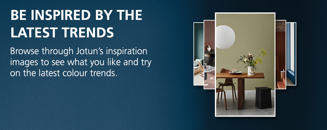
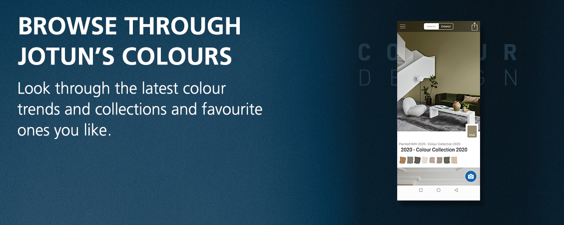
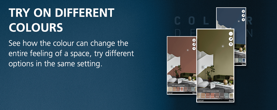
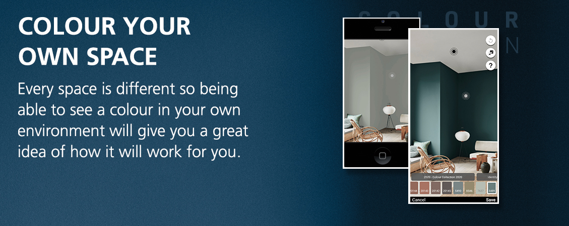
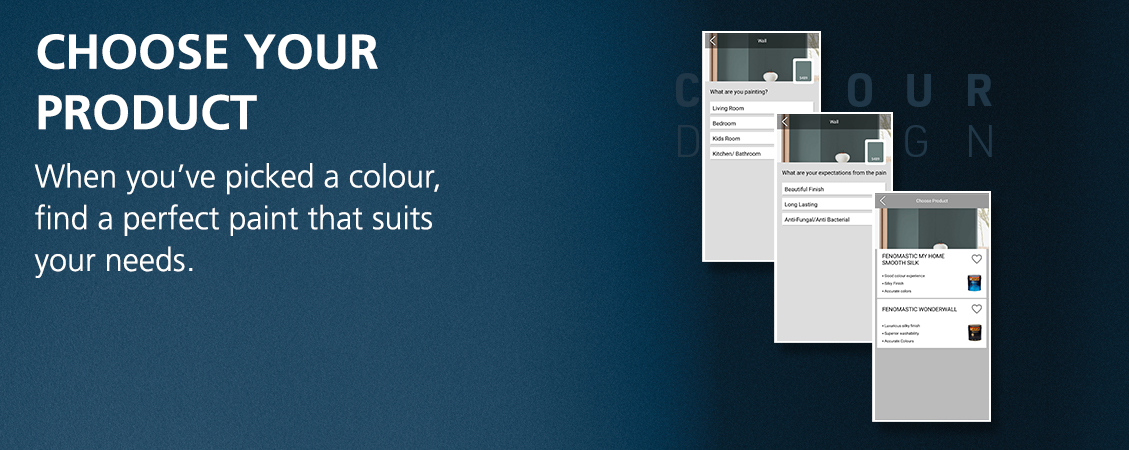
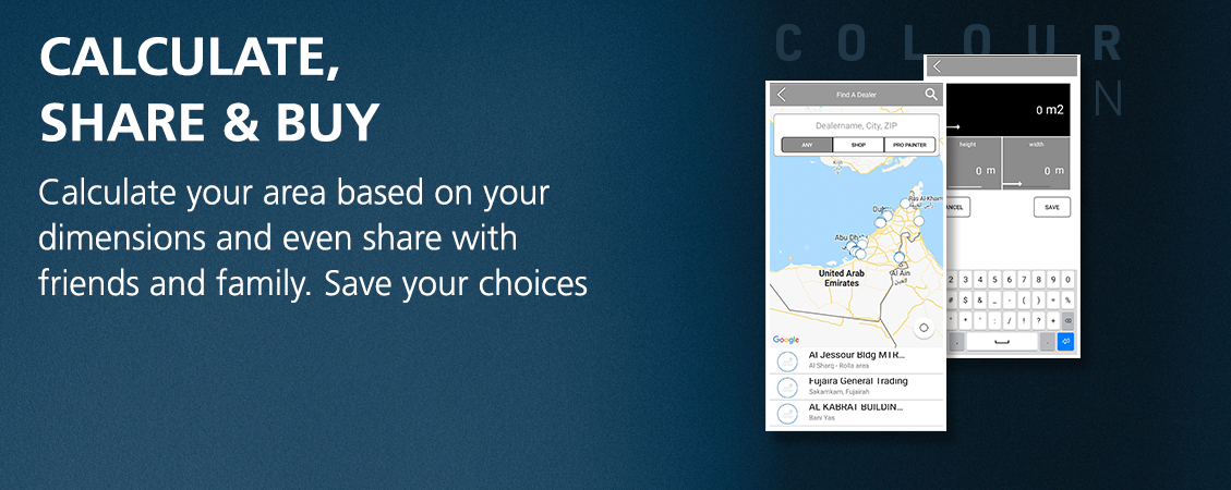
THE JOTUN COLOUR DESIGN APP
Choosing the right colours for your space can be a challenging and time-consuming task. Our Colour design app simplifies the process for you in a few easy steps, letting you experiment with paint colours like never before.